A pseudo-element is nothing but a generated box plus an optional string of content — yet it’s behind drop caps, custom bullets, the little “opens in new tab” icon, gradient overlays, and that menu that refuses to close as your cursor crosses the gap. This post tours where they earn their keep, and the accessibility traps that ride along.
Everything here is vanilla HTML and CSS, so the idea ports cleanly to CSS Modules, Tailwind’s before: / after: variants, or a styled component. Each technique is rendered live in the box above its code; poke at it as you read. In the snippets, var(--accent) is a stand-in for your brand colour, swap it for whatever token you use.
The three mental models
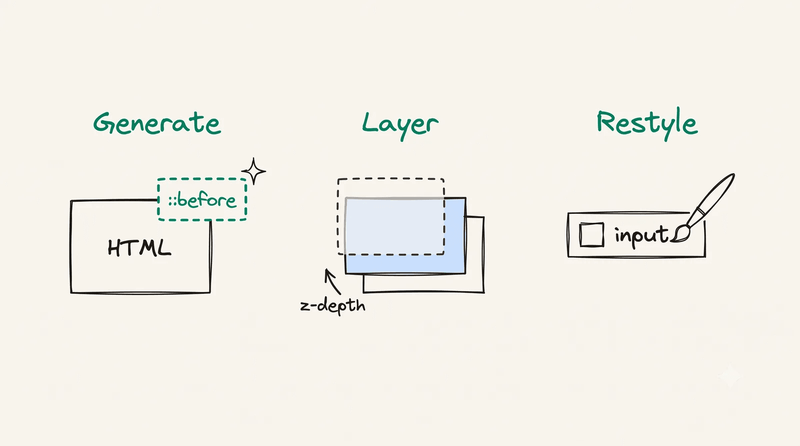
Every recipe below is one of three moves. Hold these and the rest is detail.
- Generate content with
content.::before/::after/::markerconjure a box from nothing. When that box is decorative, give it empty alt text (content: "•" / "") so screen readers skip it. - Layer with position +
z-index. An absolutely-positioned pseudo sits over or behind its host: overlays, crossfades, the hover-bridge. - Restyle boxes the browser already renders.
::placeholder,::selection,::backdrop,::file-selector-button,::first-letter. You don’t create these; you restyle what’s already there.
How that maps to what follows: the generate move powers the next two sections (Decorating text, Generated typography), layer is the Overlays section, and restyle is the last one. Each section opens by naming which move it is.
Decorating text & links
This is the generate move: content conjures a box and you place it beside the text.
The “opens in new tab” icon
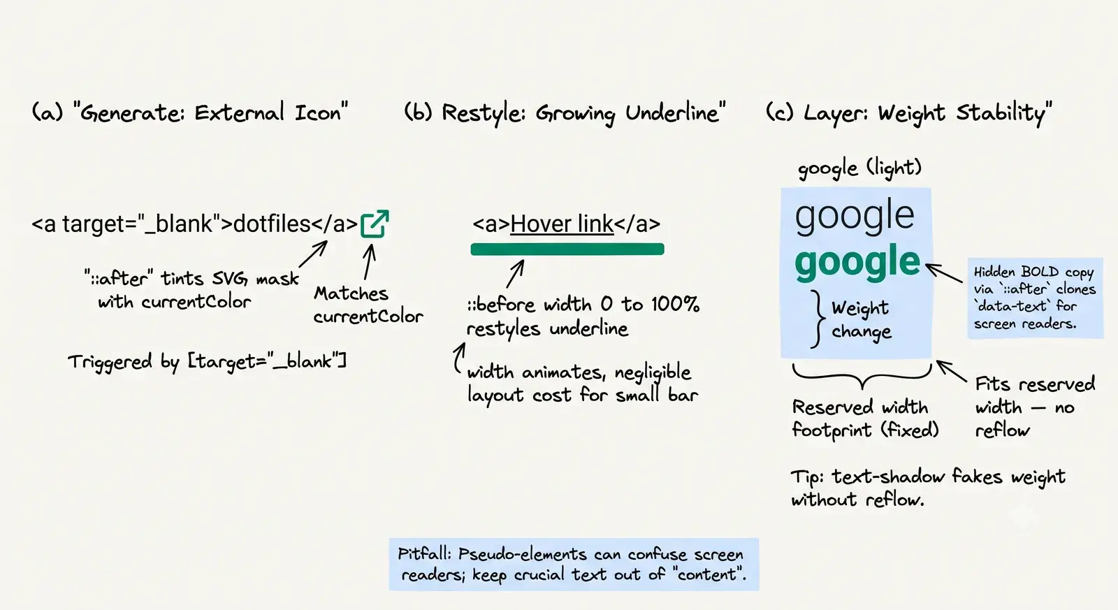
This is literally how this blog renders external links. An attribute selector targets every link that opens in a new tab, and ::after paints an icon, with no extra markup and no per-link class. The trick is mask-image: the SVG becomes a stencil and background-color tints it, so the icon always matches the link colour (currentColor).
Peek at my dotfiles to see the full setup.
/* Reacts to target="_blank" — zero extra markup */a[target="_blank"]::after { content: ""; display: inline-block; width: 0.875em; height: 0.875em; margin-left: 0.25em; background-color: currentColor; /* tints the masked icon */ mask-image: url("/icons/external-link.svg"); mask-size: cover; /* Safari < 15.4 still needs the prefixed pair */ -webkit-mask-image: url("/icons/external-link.svg"); -webkit-mask-size: cover;}The easy bug: ship only the unprefixed mask-image and the icon silently vanishes in older Safari. Always pair it with -webkit-mask-image.
Underline that grows on hover
A ::before bar pinned to the bottom of the link, animating its width from 0 to 100%. Simple, and a good excuse to explain why width and not a transform.
Hover this link to grow the underline.
a { position: relative;}a::before { content: ""; position: absolute; left: 0; bottom: -2px; width: 0; height: 2px; background-color: currentColor; transition: width 0.2s ease-in-out;}a:hover::before { width: 100%;}The stock performance advice is to animate transform: scaleX(), not width, and the reason is real: changing width alters the element’s geometry, so the browser re-runs layout and paint every frame; transform is handled by the compositor on the GPU and skips both (web.dev’s animations guide is the canonical explainer). But scaleX grows from the centre and squashes a rounded cap, and in PandaCSS the scaleX shorthand quietly emits no scale property to consume its variable, so the transform is a no-op (it bit this blog’s link underline-wipe). For a 2px bar over 200ms the layout cost is negligible, so this demo animates width and reads correctly, reach for transform when the animated box is large or the effect runs often.
Bold on hover, no layout shift
Bold a nav link on hover and it gets wider, shoving its neighbours sideways, a visible jitter. The fix: render a hidden bold copy of each label up front so the link always occupies its bold footprint; the visible text stays light, and hover just swaps weights into space that was already reserved.
<!-- data-text mirrors the label — the ::after clones it in bold --><a href="/blog" data-text="Blog">Blog</a>a { display: inline-flex; flex-direction: column; font-weight: 400; /* visible text stays light */}/* A hidden BOLD copy reserves the wider footprint up front. `/ ""` gives it empty alt text, so screen readers skip the ghost. */a::after { content: attr(data-text) / ""; height: 0; overflow: hidden; visibility: hidden; font-weight: 700;}a:hover { font-weight: 700; /* now fits the reserved width — no reflow */}A common alternative is to stack an absolutely-positioned bold copy and cross-fade its opacity on hover. That works too, but it renders the word twice in the same spot (prone to sub-pixel shimmer), and the opacity tween can’t change the metrics, so it’s purely cosmetic. Reserving width keeps a single text node in normal flow and is what you want when layout stability is the goal.
Generated typography
Still the generate move, now aimed at type: the browser’s own generated boxes (::marker, ::first-letter) and decorative glyphs.
Custom bullets
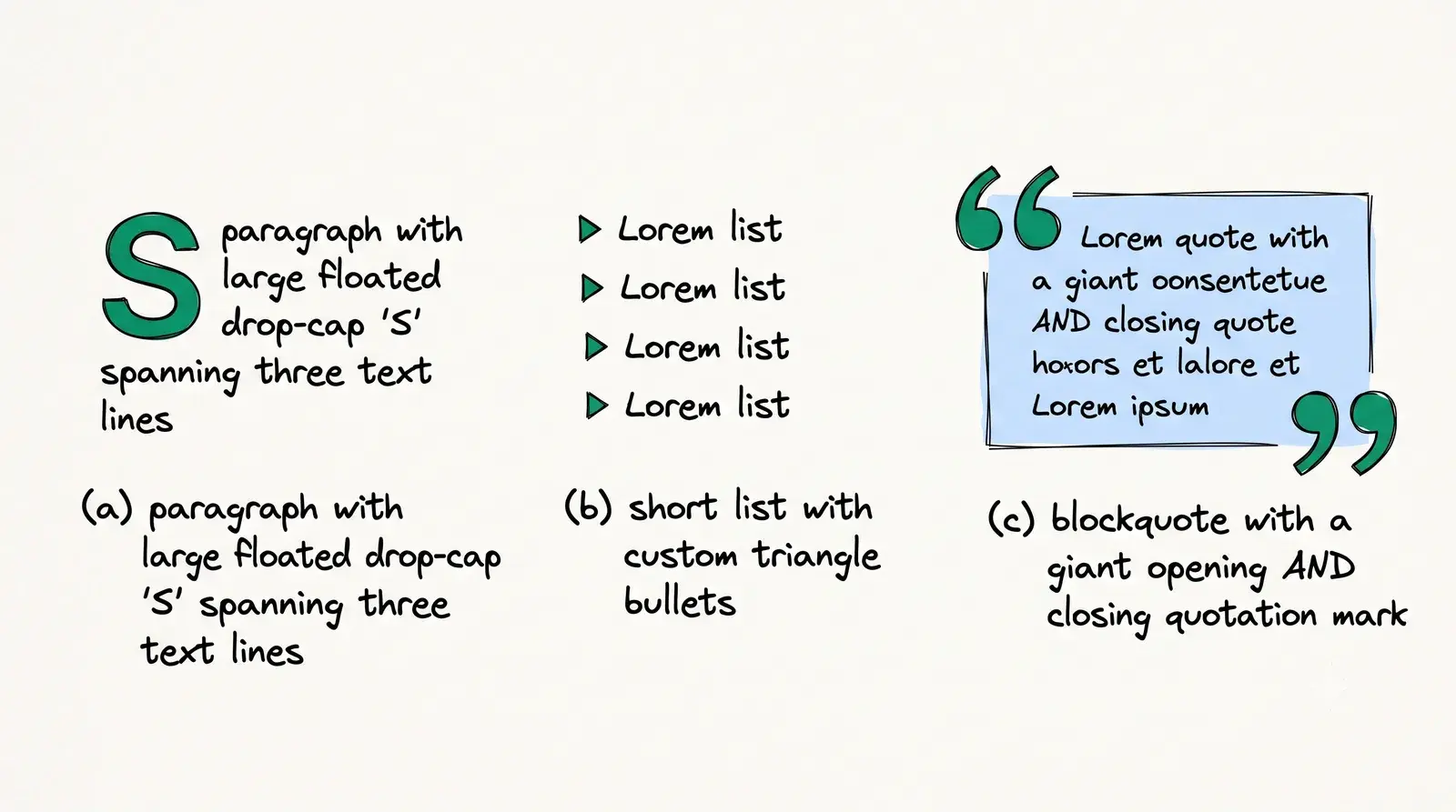
The old recipe was list-style: none plus an absolutely-positioned li::before. Modern CSS gives list items a real ::marker you can restyle directly: semantically correct and a third of the code.
- First item
- Second item
li::marker { content: "▸ "; color: var(--accent); font-weight: 700;}- First item
- Second item
/* Reach for this only when ::marker can't do the job */li { list-style: none; position: relative; padding-left: 1.5rem;}li::before { content: "▸"; position: absolute; left: 0; color: var(--accent);}The catch: ::marker honours only a tiny property set, just color, font-*, and content. The moment you need a background, a transform, an animation, or precise positioning, ::marker can’t express it and you fall back to ::before. Use the marker when it’s enough; reach for the hack only when it isn’t.
Drop cap
::first-letter selects exactly that, the first letter of a block, and pairs with its sibling ::first-line. A real drop cap floats and spans about three lines, so the text wraps snugly around it; just bumping the font size (the common half-measure) only makes the letter taller and leaves an awkward gap.
Scientists exploring the deep canyons of Monterey Bay unexpectedly encountered a rare species of dragonfish, the rarest of its kind, drifting far below the reach of sunlight. Its translucent body and needle-thin teeth had been recorded only a handful of times, each sighting rewriting what researchers thought they knew about life in the midnight zone.
p::first-letter { float: left; margin-right: 0.2em; padding: 0.1em 0.15em; font-size: 2.5em; line-height: 0.85; /* spans ~2–3 lines, not just a taller letter */ font-weight: 700; color: #fff; /* the glyph */ background: #022c22; /* deep emerald — sticker body */ box-shadow: 0.25rem 0.25rem var(--accent); /* brand accent — offset depth */ border-radius: 4px;}::first-letter only applies to block-level boxes, and it’s smart about leading punctuation: an opening quote or bracket is included with the letter.
That leaves its sibling, ::first-line. Where ::first-letter is always exactly one glyph, ::first-line styles the whole first rendered line, and it’s the more interesting of the two: there’s no “first line” in your HTML to grab. The browser works it out at layout time, so it reflows. Widen the box and different words land on line one, and the style follows them. A <span> around the first few words can’t do that. The classic use pairs it with a drop cap: small-caps or a touch of letter-spacing on the opening line, the way print eases you into an article.
For nearly a century, cartographers left the deep ocean floor blank, filling the empty space with sea monsters and guesswork. It was not until sonar returned its first echoes that the midnight zone began to take real shape on the map.
Drag the paragraph’s bottom-right corner to resize it, and the small-caps run re-flows to whatever now lands on line one.
/* Pairs with the drop cap above. `::first-line` styles the first RENDERED line, recomputed as the box resizes — so it can't be a wrapper span. Only a small subset applies (font, colour, letter/word-spacing, text-*); box metrics like margin and border are ignored. */p::first-line { font-variant: small-caps; letter-spacing: 0.03em;} Stylized blockquote marks
Giant decorative quotation marks via content, one opening and one closing. Because they’re pure decoration, they must carry empty alt text (content: "…" / ""), or a screen reader announces a stray “left double quotation mark” before every quote.
Good design is as little design as possible.
blockquote { position: relative;}/* Decorative glyphs — empty alt so they aren't announced */blockquote::before { content: "\201C" / ""; position: absolute; left: 0.08em; top: -0.08em; font-family: Georgia, serif; font-size: 4em; line-height: 1; color: var(--accent); opacity: 0.28;}blockquote::after { content: "\201D" / ""; position: absolute; right: 0.2em; bottom: 0.1em; font-family: Georgia, serif; font-size: 4em; line-height: 1; color: var(--accent); opacity: 0.28;} Semantic quotes (the <q> counterpart)
Those marks are decoration. When the quote marks are semantic, an inline <q>, don’t hand-draw them at all. A <q> inserts its own quotation marks through the quotes property, and they adapt to language and nest correctly. The marks themselves are pseudo-elements the browser adds for you.
As the spec roughly puts it, the q element represents some phrasing content quoted from another source
, and the marks come free.
q { /* level-1 marks, then the level-2 pair used when quotes nest */ quotes: "\201C" "\201D" "\2018" "\2019";}/* The marks the browser generates for you — this is the UA default, shown to make the mechanism explicit. You rarely write it yourself. */q::before { content: open-quote;}q::after { content: close-quote;} Overlays & layering
This is the layer move: an absolutely-positioned pseudo sitting over or behind its host, pointer-events and z-index deciding what’s clickable.
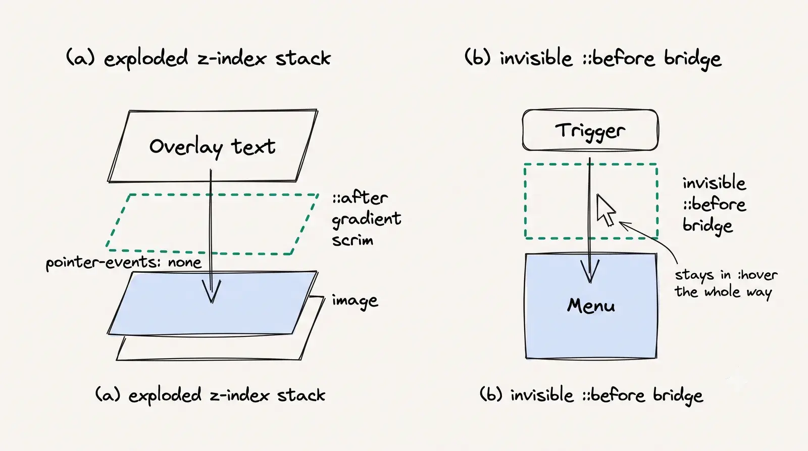
Image gradient overlay
Here’s the replaced-element rule in action, on a real card. You can’t attach a pseudo to an <img>, so wrap it and pseudo the wrapper. A static ::after scrim keeps the overlaid headline readable; on hover a second ::before veil fades in while the image zooms, the exact recipe behind this blog’s post cards. pointer-events: none lets clicks fall through to the image, and border-radius: inherit keeps both layers inside the rounded corners.
<!-- Wrap the <img>: it can't host a pseudo-element itself --><div class="promo-media"> <img src="cover.jpg" alt="…" /> <div class="promo-overlay"><h4>Deep-sea field notes</h4></div></div>/* Can't pseudo an <img> — wrap it, pseudo the wrapper */10 collapsed lines
.promo-media { position: relative; overflow: hidden; border-radius: 10px;}.promo-media > img { display: block; width: 100%; transition: transform 0.4s ease;}/* Static readability scrim */.promo-media::after { content: ""; position: absolute; inset: 0; background: linear-gradient(to top, rgba(0, 0, 0, 0.75), transparent 60%); pointer-events: none; border-radius: inherit;}/* Hover dim veil */.promo-media::before { content: ""; position: absolute; inset: 0; z-index: 1; background: rgb(0 0 0 / 0.4); opacity: 0; transition: opacity 0.4s ease; pointer-events: none; border-radius: inherit;}.promo-media:hover::before { opacity: 1; }.promo-media:hover > img { transform: scale(1.05); } Gradient crossfade on hover
The lesson hiding in this one: gradients aren’t animatable. background-image doesn’t interpolate, so a transition on it just snaps. The workaround is to stack a second gradient in a ::before and transition its opacity: cheap, GPU-friendly, and smooth.
Hover for a gradient shift
Two layers cross-fade; you can’t tween the gradient itself.
4 collapsed lines
.card { position: relative; overflow: hidden; background: linear-gradient(45deg, #ff758c, #ff7eb3);}/* The second gradient, hidden until hover */.card::before { content: ""; position: absolute; inset: 0; background: linear-gradient(45deg, #667eea, #764ba2); opacity: 0; transition: opacity 0.5s ease-in-out; border-radius: inherit;}.card:hover::before { opacity: 1;}.card > * { position: relative; z-index: 1; /* keep the text above the ::before layer */}The same two-layer trick powers a soft glow or drop-shadow that fades in on hover: paint the shadow on a ::before behind the element (z-index: -1) and transition its opacity, instead of animating box-shadow directly (which forces a repaint every frame).
The invisible hover-bridge
The most practical trick here, and the least known. A navbar dropdown that opens a few pixels below its link has a dead gap between them: aim the cursor straight down at the submenu and it crosses unhovered space, the link loses :hover, and the menu snaps shut before you arrive. Hover Products in the Without bridge column below and try to reach a submenu item, it closes on you. The fix is a transparent ::before that spans exactly that gap, so the cursor never leaves a hover region mid-travel; the With bridge column runs the identical path and holds.
/* A nav item that reveals its submenu on hover */.has-menu { position: relative;}.submenu { position: absolute; top: calc(100% + 12px); /* a 12px gap below the link */ opacity: 0; visibility: hidden; transform: translateY(-6px); transition: opacity 0.18s ease, transform 0.18s ease;}/* The bridge: a transparent ::before fills that 12px dead zone, so the cursor stays inside a hover region all the way down. */.has-menu::before { content: ""; position: absolute; top: 100%; left: 0; width: 100%; height: 12px;}/* Reveal on hover OR keyboard focus, so the menu isn't a pointer-only trap. */.has-menu:hover .submenu,.has-menu:focus-within .submenu { opacity: 1; visibility: visible; transform: translateY(0); /* slides down smoothly on open */}The Without bridge column is the same markup with that ::before rule deleted, nothing more. A handy debugging move: give the bridge a background: rgba(255, 0, 0, 0.25) while you’re building it, confirm it covers the gap, then make it transparent. Adding :focus-within alongside :hover (as above) is the small extra that keeps keyboard users from being locked out, since the bridge only fixes the pointer path.
Styling browser-rendered boxes
The third move is restyle: boxes the browser already draws. You don’t create these; you repaint what’s already there.
Placeholders and the contrast trap
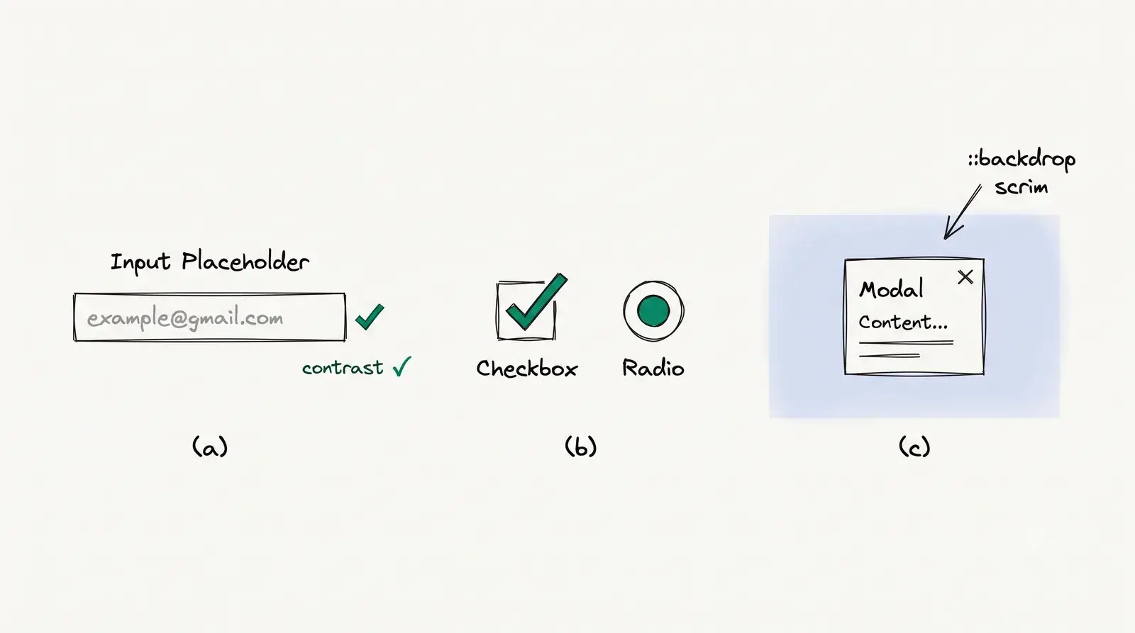
::placeholder restyles the hint text inside an input, honouring only a small subset of properties (colour, font, opacity). The trap is contrast: placeholder text is real text, so it has to clear WCAG’s 4.5:1 minimum. The ubiquitous #ccc-on-white is about 1.6:1, so it fails outright, and worse, faint placeholders get mistaken for pre-filled values.
/* Placeholder text is real text — it must clear WCAG contrast. #767676 ≈ 4.54:1 on white (passes AA); #ccc ≈ 1.6:1 fails. */input::placeholder { color: #767676;} Brand the highlight
One rule, a lot of polish: ::selection restyles the highlight when a user drags across your text. Like ::marker, it accepts only a short list of properties (color, background-color, text-shadow, and a few more), but that’s all you need to swap the default browser-blue for your brand colour.
Select this sentence to see the custom highlight color.
/* Translucent, so the text keeps its own colour and stays readable */::selection { background-color: color-mix(in srgb, var(--accent) 25%, transparent);}Keep the text/background contrast high; a low-contrast selection is harder to read than the default.
Required-field asterisk
A red * via content is the conventional “required” marker. But the glyph is decoration: the accessible meaning has to live in the markup, the input’s required attribute (which assistive tech announces) and a clear accessible name. Never rely on a pseudo-element’s content to convey that a field is mandatory; CSS can be disabled, and generated content is unreliable in the accessibility tree.
/* Decorative glyph only — the real "required" lives on the <input> (the `required` attribute) and in the field's accessible name. */label.required::after { content: "*"; margin-left: 0.25rem; color: #dc2626;} Faux checkbox & radio
Custom checkboxes and radios are the classic pseudo-element exercise, and the classic way to lock keyboard users out. 😅 The trap is the common recipe that hides the native input with the hidden attribute, which drops it from the tab order and the accessibility tree: now keyboard users can’t toggle it, :focus-visible never fires, and screen readers don’t announce it.
The fix is the payoff of this whole post. Remember the opening rule, that replaced elements can’t host ::before / ::after? appearance: none un-replaces the control, so the real input can now host its own pseudo-elements. Keep the input, draw the box and the tick on it, and keyboard, focus, and screen-reader support all come free.
/* Keep the REAL input. appearance:none un-replaces it, so now it can10 collapsed lines   host ::before — keyboard, :focus-visible and AT all keep working. */input[type="checkbox"],input[type="radio"] {  appearance: none;  display: inline-grid;  place-content: center;  width: 1.15em;  height: 1.15em;  border: 2px solid #555;}input[type="checkbox"] { border-radius: 4px; }input[type="radio"]    { border-radius: 50%; }
/* The tick / dot, drawn on the input's OWN ::before */input[type="checkbox"]::before,input[type="radio"]::before {  content: "";  transform: scale(0);  transition: transform 0.12s ease-in-out;  background: var(--accent);}input[type="checkbox"]::before {  width: 0.65em;  height: 0.65em;  clip-path: polygon(14% 44%, 0 65%, 50% 100%, 100% 16%, 80% 0, 43% 62%);}input[type="radio"]::before {  width: 0.6em;  height: 0.6em;  border-radius: 50%;}input:checked::before {  transform: scale(1);}input:focus-visible {  outline: 2px solid dodgerblue;  outline-offset: 2px;}
If you don’t need a fully bespoke look, the even simpler modern primitive is accent-color: one property tints native checkboxes and radios in-place, no pseudo-elements at all. Reach for the appearance: none recipe only when you need to draw the control yourself. For the full accessible treatment, Sara Soueidan’s inclusive checkbox/radio guide is the canonical reference.
Dialog & popover scrims
::backdrop restyles the dimmed layer the browser paints behind a top-layer element. You don’t create it; the browser does. Here it is on a modal <dialog>: a dim, blurred scrim, and its close buttons sit on the dialog itself.
/* Paints only for a TOP-LAYER element — a modal opened with dialog.showModal(), or a popover. Never a plain <dialog open>. */dialog::backdrop { background: rgb(0 0 0 / 0.5); backdrop-filter: blur(2px);}The one catch worth keeping: ::backdrop lives only in the top layer. A plain <dialog open> renders inline with no backdrop, so you earn one from dialog.showModal() (or a popover, which is also top-layer). (MDN: ::backdrop.)
Also worth knowing (lightning round)
A few more pseudo-elements worth a line each. Reach for the spec when you hit one:
- View Transition pseudo-elements (
::view-transition-group(),::view-transition-old/-new). The fanciest pseudo-elements most people never realise are pseudo-elements. Dogfood: this blog’s cover-morph between the listing and the open post is choreographed through them. Its own post someday. ::details-contentstyles the expandable region of a<details>, the element this blog animates without JS. Landing in browsers now; mind support.- Skeleton shimmer. An
::afterwith a sweeping gradient, animated across a loading placeholder. Dogfood: this blog’sskeleton()pattern. - CSS counters use
counter-reset/counter-incrementpluscontent: counter(name). The engine behind auto-numbered sections or a:::stepsdirective; its own post someday. - Custom Highlight API (
::highlight()) paints arbitrary text ranges driven from JS, the modern way to highlight search hits (what a client-side search like Pagefind wants).
For the full roster, MDN’s pseudo-elements index is the reference, and Kevin Powell’s CSS videos are the best gentle walkthroughs of the ones above.
Rules of thumb
A handful of rules of thumb that survive every one of these patterns:
- Reach for the modern primitive first.
::marker, thequotesproperty,accent-color, popover, before the::beforehack. Less code, better semantics. - Decorative
contentgets empty alt. Anything a screen reader shouldn’t read needs/ "". - Can’t pseudo it? Wrap it or un-replace it. Replaced elements reject
::before/::after; wrap in a<div>, orappearance: noneto un-replace a form control. - Never fake meaning with a glyph. “Required”, “external”, checked/unchecked: the meaning lives in markup; the pseudo is just paint.
- Animate the cheap properties. Cross-fade a second gradient’s
opacity; don’t tweenbackgroundorbox-shadow. Reservetransform/opacityfor motion. (Josh Comeau’s transitions guide is the deep dive.) ::backdropneeds the top layer. It paints forshowModal()/ popover, never<dialog open>.
Master those three moves and the “how is that pure CSS?” tricks stop being magic — each is just a box you generate, layer, or restyle. The habit under all of them is what I’d keep, though: reach for the real element before a wrapper <div>, leave the meaning in the HTML, and let the pseudo-element carry only the paint.